Awesome Overlays
Demoing a practical application of the CSS3 border-image property.
What's the big deal?
These overlays use a number of new CSS properties, some of which are simple like border-radius and using RGBa colors.
The trick with these overlays is the gradient border, going form a lighter to darker orange as you go from top to bottom. To create that effect we used to the border-image property, which is a tricky little addition to CSS.
div.note div.border {
  border: 5px solid #feb515;
  -webkit-border-radius: 3px; -moz-border-radius: 3px;
  -webkit-border-image: url(/images/awesome-overlays/border-image.png) 5 5 5 5 stretch;
  -moz-border-image: url(/images/awesome-overlays/border-image.png) 5 5 5 5 stretch;
}
How to use border-image
The border-image property is tricky in the way it takes a single image and turns it into a complete object border for any sized element. What it does is take the image you specify and divide it into an even 3x3 grid — it then takes the top left element and makes that the top left corner, then takes the top center and stretch that across the top border of the object, and so on until it has used all 9 pieces.
What can potentially screw things up is that it takes the center section and stretches it across your entire object. So to achieve a traditional border with a transparent object, we had to cut out the center of our border image. Take a look at these illustrations:
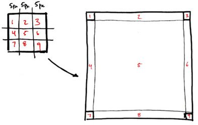
This is a sketch of how the browser cuts up your image into the border-image elements...
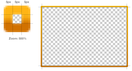
...and this is the image we're using (enlarged), and how each piece becomes an edge to our overlay object.
The rest of the syntax
The first part of the syntax is simply the path to the image you'll be using. The second piece seen here is the border-width for each side.
It's important to note that the nine sections of your border image will be scaled to fit this width, thus a 9x9 image with a 9px border width would have each piece scaled to three times its size. We used a 15x15 image so that each section would be 5x5 and fit into our border width.
url(/images/awesome-overlays/border-image.png) 5 5 5 5 stretch;
Stretch means the browser should take each section and stretch it to fit the border width we specify. The other options are repeat and round. There's already a great demo availble to see how each option works.
url(/images/awesome-overlays/border-image.png) 5 5 5 5 stretch;
Copyright ZURB, freely available for distribution under the MIT license.
Check out other Playground experiments
Foundation CSS Grid Examples
Foundation CSS Grid + Container Queries
Foundation Grids within Grids

Reactive Animation Listener
