Product Design Training from the Experts at ZURB
Shadow Experiments
Using a little HTML and some CSS we take a trip to the dark side of the moon, create a periodic table and make a radioactive love concoction. We even throw some CSS animations in there to add to the party.
Note: Demo works best in Safari 4.x and Chrome. Firefox...not so much
What’s so great?
Shadows are cool. We started out having to create our shadows in Photoshop and attaching them as background images. Now our lives are made easier with CSS. But really, all we can do is add gratuitous amounts of box shadows to our elements, right? Or, we can only really add unnecessary shadows to our text, right? Wrong.
The CSS box-shadow and text-shadow allow us to create some pretty cool design elements that don't even look like shadows. The key is to think about how CSS shadows work and use them to get the desired effect. Don't limit your thinking into only using them mere drop shadows.
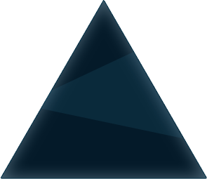
The first example usage, seen above with the recreation of the Dark Side of the Moon album cover, may seems a little impractical but you can use these same techniques to create other design elements.
Any colour you like
For this example we'll use a single <div id="rainbow"> to act as our rainbow element.
The interesting part comes with the CSS. Now you'd think that each element on the page would only be allowed to use one shadow but that would just be silly. The truth is that you can add up to 999 shadows to a single element. Crazy huh?
To create our rainbow, we're going to only use 100 shadows. You just have to separate each shadow by a comma. In our code on the left we only show the first 10 shadows in full. Each color bar is made up of 20 shadows. Change up the colors!
Don't stop there!
You can use -webkit-transform or -moz-transform to rotate the new CSS rainbow and place it how ever you'd like. Also, don't hestiate to add in an image or two to complete whatever look you're going for.
The HTML is simple enough
/* All you need is one element to style. */

<div id="rainbow"></div>
The CSS is where the fun begins
/* Get some basic styles down */

div.rainbow {
  width: 500px
  height: 500px
  -webkit-border-radius: 30px
  -moz-border-radius: 30px

  /* Now for some shadow action */
  -webkit-box-shadow: 1px -1px #b2492c, 2px -2px #b2492c, 3px -3px #b2492c, 4px -4px #b2492c, 5px -5px #b2492c, 6px -6px #b2492c, 7px -7px #b2492c, 8px -8px #b2492c, 9px -9px #b2492c, 10px -10px #b2492c, ...
  11px -11px #b2492c, ...
  21px -21px #ea5f24, ...
  31px -31px #ea5f24, ...
  41px -41px #f8c617, ...
  51px -51px #f8c617, ...
  61px -61px #068e8c, ...
  71px -71px #068e8c, ...
  81px -81px #0bc3b8, ...
  91px -91px #0bc3b8, ...
  100px -100px #0bc3b8;

  -moz-box-shadow: 1px -1px #b2492c, ...
  100px -100px #0bc3b8;
}
Example 2:
Periodic Table
How it's done
She blinded me with science
So let's say you're a science teacher who is also an awesome designer. The only thing for you to do is make the the periodic table of elements with HTML and CSS! We made our grid of elements using a bunch of ul's but you can apply these rules to pretty much anything. Come to think of it, someone should create some super awesomer buttons using some killer box shadows.
This should come in handy while you're tracking down and killing an alien race.
The HTML
<ul class="peri-boxes" id="alkali-metals">
  <li>
    <a class="green box gas" href="#"> H </a>
  </li>
  <li>
    <a class="orangellow box" href="#"> Li </a>
  </li>
  <li>
    <a class="orangellow box liquid" href="#"> Fr </a>
  </li>
</ul>
The CSS is where the fun begins
/* Get some basic styles down */

ul.peri-boxes li {
  float: left;
  width: 52px
  height: 52px
  margin: 0px
}

ul.peri-boxes li a {
  float: left;
  width: 52px
  height: 37px
  font-size: 16px
}

ul.peri-boxes li a.box {
  background-color: #1b2a34;
  color: #fff
  border: 1px solid #000
  -webkit-box-shadow: 1px 1px #000, 2px 2px #000, 3px 3px #000, 4px 4px #000, 5px 5px #000, 6px 6px #000, 7px 7px #000, 8px 8px #000;
  -moz-box-shadow: 1px 1px #000, 2px 2px #000, 3px 3px #000, 4px 4px #000, 5px 5px #000, 6px 6px #000, 7px 7px #000, 8px 8px #000;
  -webkit-transition: ll 0.12s ease-out
  -moz-transition: ll 0.12s ease-out
}

ul.peri-boxes li a.box:hover {
  background-color: #2daebf;
  left: -23px;
  top: -23px;
  width: 62px;
  height: 47px;
  z-index: 1;
  font-size: 1.5em;
  border: 1px solid #2daebf

  -moz-box-shadow: 1px 1px #007d9a, 2px 2px #007d9a, 3px 3px #007d9a, 4px 4px #007d9a, 5px 5px #007d9a, 6px 6px #007d9a, 7px 7px #007d9a, 8px 8px #007d9a;

  -webkit-box-shadow: 1px 1px #007d9a, 2px 2px #007d9a, 3px 3px #007d9a, 4px 4px #007d9a, 5px 5px #007d9a, 6px 6px #007d9a, 7px 7px #007d9a, 8px 8px #007d9a;

  -webkit-animation-name: boxPulse;
  -webkit-animation-duration: .7s;
  -webkit-animation-iteration-count: infinite;
  -webkit-animation-delay: .12s;
}
Set up our animation
To give our periodoc table that extra little something. We make a -webkit animation that makes them float in the air.
@-webkit-keyframes boxPulse {
  from {
    width: 62px;
    height: 47px;
    left: -23px;
    top: -23px;
    -webkit-animation-timing-function: ease-out;
  }
  50% {
    width: 58px;
    height: 45px;
    top: -19px;
  }
  to {
    width: 62px;
    height: 47px;
    left: -23px;
    top: -23px;
    -webkit-animation-timing-function: ease-out;
  }
}
Example 3:
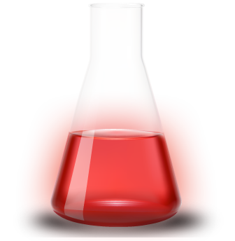
Love Potion No. 9
How it's done
Get that lovin' feelin' back
We've all been there. The person you love most doesn't love you back. While we don't suggest you give them a "floorie", you can create a nifty love potion with CSS bubbles.
For our little concoction, we use a simple image for the beaker and then creat the bubbles entirely with markup and CSS.
The HTML for our bubble
<div id="beaker">
  <span class="bubble">
    <span class="glow"> </span>
  </span>
</div>
With our bubbles all made, now we need them to act like bubbles. We could use Javascript but that's no fun. Just use CSS!
There are a few things we need to animate. The vertical postioning is obvious, but we also want to scale the bubbles as they travel up. Lastly, we need to account for the "popping." Take a look at bubbleFloat to see how we did it.
In addition to making the bubbles float up, we also need to make the bubles glow to give'em that radioactive look. Look at redPulse to see how we did it.
Set up our animations
@-webkit-keyframes bubbleFloat {
  from {
    bottom: 110px; -webkit-transform: scale(.3); opacity: 0; -webkit-animation-timing-function: ease-in-out;
  }
  1% {
    bottom: 110px; -webkit-transform: scale(.3); opacity: 0; -webkit-animation-timing-function: ease-in-out;
  }
  30% {
    bottom: 110px; -webkit-transform: scale(.8); opacity: 1; -webkit-animation-timing-function: ease-in-out;
  }
  95% {
    bottom: 545px; -webkit-transform: scale(.3); opacity: 1; -webkit-animation-timing-function: ease-in-out;
  }
  99% {
  bottom: 550px; -webkit-transform: scale(3); opacity: 0; -webkit-animation-timing-function: ease-in-out;
  }
  to {
    bottom: 110px; -webkit-transform: scale(.9); opacity: 0; -webkit-animation-timing-function: ease-in-out;
  }
}
@-webkit-keyframes redPulse {
  from { -webkit-box-shadow: 0 0 30px #eb1c2a;}
  50% { -webkit-box-shadow: 0 0 80px #c91a26; }
  to { -webkit-box-shadow: 0 0 30px #eb1c2a;}
}
Now just rinse and repeat to create all your bubbles!
These are just a few examples of how you can use CSS box shadows to create some cool effects. Let us know how you're using them to make the web more awesome.
Make 'em look bubbly
div#beaker {
  height: 700px;
  position: relative;
}
div#beaker span.bubble {
  width: 100px;
  height: 100px;
  position: absolute;
  display: block;
  left: 120px;
  bottom: 110px;
  -webkit-border-radius: 200px;
  background: -webkit-gradient(radial, center center, 0, center center, 100, from(rgba(239,29  ,43,.2)), to(rgba(255,255,255,.7)));
  -webkit-animation-name: bubbleFloat;
  -webkit-animation-duration: 5s;
  -webkit-animation-iteration-count: infinite;
}
div#beaker span.glow {
  width: 100%;
  height: 100%;
  position: relative;
  display: block;
  -webkit-border-radius: 200px;
  -webkit-animation-name: redPulse;
  -webkit-animation-duration: 2s;
  -webkit-animation-iteration-count: infinite;
}
Check out other Playground experiments
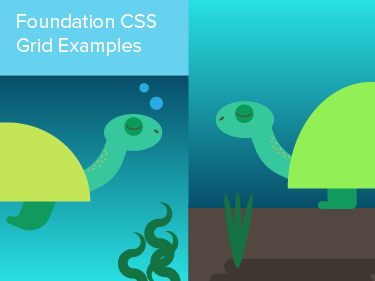
Foundation CSS Grid Examples
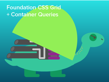
Foundation CSS Grid + Container Queries
Foundation Grids within Grids

Reactive Animation Listener
