Responsive Sketchsheets
Start working out your responsive layouts through sketches using our super awesome responsive sketchsheets!
What's this for?
We're embracing design for a multi-device world. So we need to start thinking about how our sites will look on smaller devices early on in the design process.
Your code shouldn't dictate how your layouts will respond to different screen sizes. Work through those problems using these sketchsheets before you dive into code, and both you and your clients will have a clearer vision of how layouts will change on different devices.
Download Sketchsheets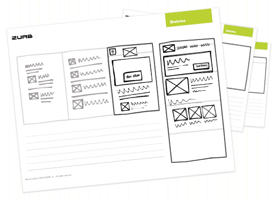
Wait, there's more!
We also included our regular ZURB sketchsheets that you can use for your not responsive layouts!
Already have those? Download just the responsive sketchsheets
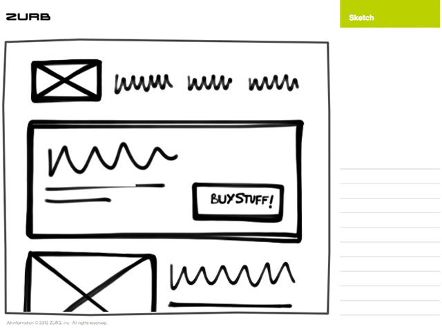
What's included?
The sketchsheets will make it super easy for you to start designing responsive sites, with room to work through elements that might change in a responsive layout, such as off-canvas layouts and navigation.
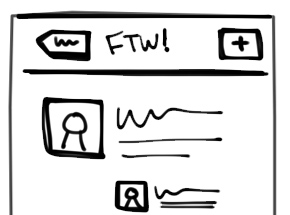
Phone
These focus on sketching out phone flows and layouts. If you're going the mobile-first route, you might want to start here.
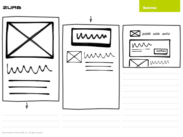
Desktop and Phone
Highlight differences between phone and desktop layouts, and represent how a layout might stack on mobile.
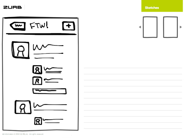
Off-Canvas Layouts
These are great for sketching out off-canvas content, with mobile and desktop versions included.
How to Use the Sketchsheets
Start with Desktop
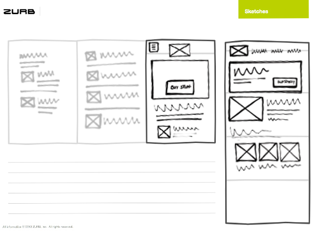
You'll find two files in our sketchsheets folder, one PDF contains the original ZURB sketchsheets, and the other responsive-flavored PDF.
Start sketching out your desktop layouts using the normal sketchsheets as you normally would.
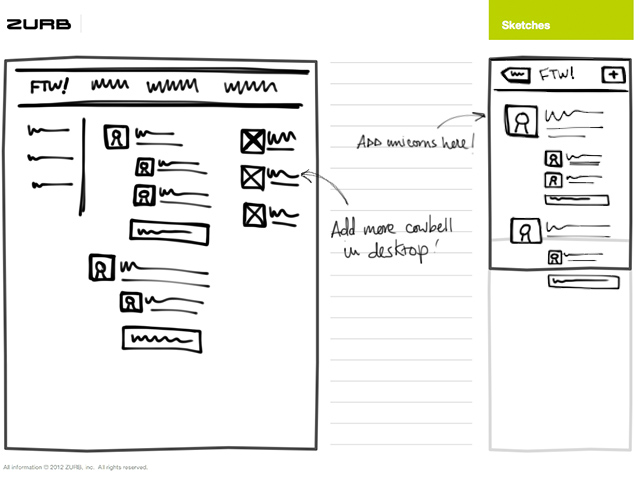
Sketch Responsively!
Move on to mobile hotness, and start with thumbnail sketches of the desktop layout, alongside the mobile layout.
Planning to implement our sweet off-canvas layouts? No problem! You can start visualizing the content and layout of these elements using the sketchsheets.
Aww yeah, Mobile-First!
So you're starting with mobile, you daring designer, you! Here's what you'll need to do. Sketch using the responsive sketchsheets and start with the full-size mobile sheets, then move onto thumbnail sketches for the desktop layouts.
Get the Sketchsheets
Try these for yourself and add another layer of awesome to your work. Want to find out more about why we made these?
Download SketchsheetsCheck out other Playground experiments

Morse Code for Foundation

Pizza Pie Charts
Prototyping Mobile First
Foundation 4 Stencil Sets
