The Secret to Successful Design Sketches by Mark

Before any ZURBian dives into traditional wireframes, we sketch. We sketch a lot. We sketch so much that we made our own OmniGraffle "sketch sheet" template for faster sketching. The more we sketched, the more we realized we had something really great here, a tactic that has very powerful results if presented right.

Here's the real kicker: the secret to successful design sketches is actually just drawing more of less. In other words, design sketches only become that powerful with the right presentation with as few lines as possible. Presenting complicated sketches to clients is a confusing time sink that has no real value to you as a designer.

Conveying as many ideas as possible with the least amount of effort is what makes your sketches valuable, not only to you, but your clients as well. Sketching like this helps break ideas wide open, and keeping them simple means they're more abstract and conceptual. That means you can easily riff on ideas until you're ready to execute on them with hifi wireframes and designs, keeping you agile up to the very last minute.

Let's take a look at a few examples of effective design sketching.

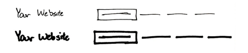
Navigation: Box, dash, dash, dash.

Navigation provides structure, and although the purpose of navigation is relatively straight forward, it can be incredibly complex at times.

When you're sketching, keep it as minimal as possible and focus on the key usability elements of a successful navigation: simple labels and an active state to show where users are in the site.

Headings and Text: Nothin' but lines.

When sketching copy of any kind, headings or body text, a series of lines is often all that you know. Keeping it as simple as possible once again is the key to understanding what these lines represent, but they also keep you honest when it comes to writing that content.

We like to help people discern body text from headings by varying our use of squiggly lines over straight lines. Large squiggly lines or empty long rectangles are for headings because they garner more attention while smaller straight, parallel lines are for body text.

Process and Workflows: One box at a time.

It's often important to convey a short workflow or set of pages in one sitting. For that, the best presentation is in showing them all on one page, separating each step with its own box. Get scrappier at this point and show even less detail around the key flow you're trying to illustrate.

Make It Thick: Sharpies for the win.

Chicken scratch never works when it comes to sketching. Feel free to use a finer point to convey your points as notes on the sketch, but keep things as thick as possible. This helps keep you in the "rough" mindset, ignoring some of the finer details to help focus on the bigger picture.

Depth and Prominence:
Cool shading.

Although we advocate keeping things as simple as possible, presentation is everything.

A little shading goes a long way towards making a sketch more visually pleasing, as well as feeling more authentic. Depth perception and differentiation between blocks of content can be aided by even the smallest amount of Letraset grayscale markers.

It helps mimic the styles and visual presence most elements get in the real world, once design implementation starts.

And there you have it—five quick tips for simpler, faster, and more effective design sketching. We use these techniques in our own sketches every day. It's become an invaluable service for our clients, allowing us to explore a vast magnitude of ideas with low investment and high value.

Next time you're sketching ideas, think about your techniques just a little more to help simplify the message and add more value to your time and effort.

6 Comments

  • Wayde Christie says:

    Great post Mark.

    We're currently trialling a great little AIR app called Balsamiq Mockups. It allows you to quickly prototype designs usings a simple drawing style. Fully extensible and community supported too.

    Cheers!

  • Alice Lankester says:

    you should share your OmniGraffle template! I'd love that! (I don't like OmniGraffle as well as I like Visio, but I like the Mac so much more than anything, I'll live with it.)

  • Mark says:

    @Wayde: Looks cool! Love that it maintains that rough look of a sketch as you're prototyping things. Helps keep you in that agile mindset.

    @Alice: We're working on releasing our own OmniGraffle templates! We'll see about porting them to Visio, too, but no one here actually uses it! What don't you enjoy about OmniGraffle? I first tried it over a year ago, but it's improved a lot since then.

  • Scott Weber says:

    Those using the 960 grid system there are some great templates to use for download. I like the sketch sheets which gives you a browser frame and grid lines to work in. http://960.gs/

  • Mark says:

    @Scott Weber: Definitely like the sketch sheets with browser frame and a grid, but are they really necessary? We've thought about different ways to simulate the way we work on the computer when we're sketching or whiteboarding, but we always end up dismissing it.

    Sketching is about producing rapid, simple, and rough ideas—having browser chrome so early on can be a distraction from those rougher ideas. That said, the grid is very useful—one of our favorite sketchbooks has been the Dot Grid Book from Behance.

    And it's worth noting that the DC Website Stencil Kit is also pretty sleek for what you're looking at—browser chrome, grid, and even a stencil for the finer details.

  • Jeremy (ZURB) says:

    Mark, awesome post. You're hitting the nail on the head about what sketching is and isn't. Sketching is purposefully low fidelity to help get lots of ideas out that leave holes.

    Sketches are social. The messier they are, the more social they are, because they invite other people in to read them, interpret in their own way, and serve as a springboard for new ideas.

    There's a time and a place for a beautiful, detailed sketch (most often called a "wireframe" or "mockup"), but think about how that impacts the social conversation that results. Beautiful and detailed work implies, "I'm already almost done with this, but you can take a look."

    Whereas sketches tend to say, "I'm just exploring ideas and I'm not committed to any of these yet. Come on in and help influence the direction."

Add your comment...

Required

Required, but not shared. Nerd's honor.

About the ZURBlog

The ZURBlog is where we discuss design interaction and strategy. We use design thinking to challenge businesses and designers to improve the products and services they create.

What's the ZURBword?

What's the ZURBword?

ZURBword.com is our thoughts on interaction design and strategy. What?

Latest Tweet

Amazing day snorkeling and snuba diving on Maui- this picture of Dmitry pretty much sums up the day: http://bit.ly/cePfMu

Photos on Flickr

  • 4339485219_cd6c5d00b9_s
  • 4336219333_9a9652ddc1_s
  • 4336214137_b5ccacfb8d_s
  • 4336951768_99551210de_s
  • 4336943776_f7800f90a6_s
  • 4336936660_ac887ba366_s
  • 4336188701_b3eb2ab0df_s
  • 4336183613_83008c078c_s
  • 4336924868_99c1597238_s

Videos on YouTube

Bookmarks on Delicious

Wanna talk? Call us at (408) 341-0600.

Hmm, not a big talker. Email us to .

Still here? Great, we're hiring.

We need people with chops to join our quest
for world domination. Want a job, nerd?

What's the ZURBword?

ZURBword.com is our thoughts on interaction design and strategy. What?

Subscribe to ZURBnews

Get our monthly newsletter, ZURBnews.
Check out last month's edition »