Bryan Zmijewski on Jul 4, 2026 · 8 minute read
Radar: Building a design and product newsroom that runs itself on loops
Let’s get acquainted if you haven’t followed us. We're ZURB.
Read More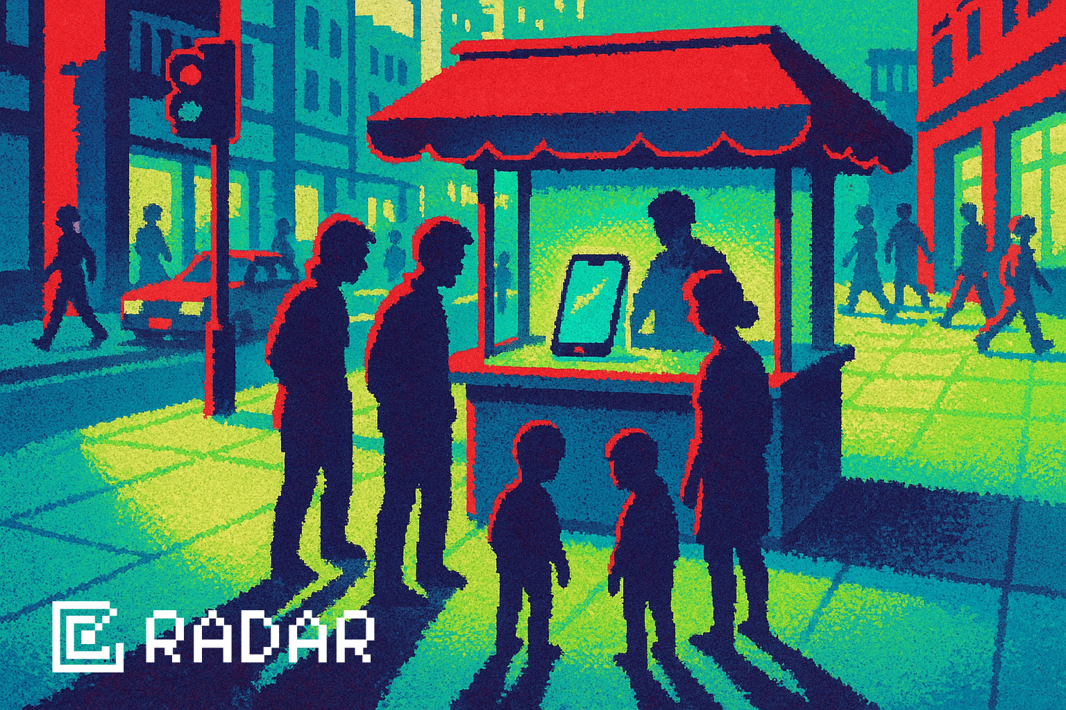
Let’s get acquainted if you haven’t followed us. We're ZURB.
Read MoreYou're well on your way to collecting all the cows! Either check them out now, or click on the cow in the footer!
Check it out